So I finally got my copy of The Wonderful 101 today and I thought to myself as I looked at the cover, “damn Nintendo, that’s an explosion of awesomeness“. After finishing my first session with the game I put the disc back in the case and placed it alongside Pikmin 3 which I also recall looking pretty cool too. It was at this point that I decided to search the internet and take at look at some recent Nintendo box art from the past year, my findings were very colourful to say the least.
Over the years I wouldn’t say traditionally Nintendo has had fantastic or downright appalling box art for their games, they’ve generally just got the job done. I’m not really sure what’s happened over at Nintendo recently but I’m really liking just about everything they’re doing with their cases these days. It’s gotten to the point where I’m actually excited to see what the box art for Mario Kart 8, Super Smash Bros 4 and Bayonetta 2 will look like which is kind of sad when you think about it.
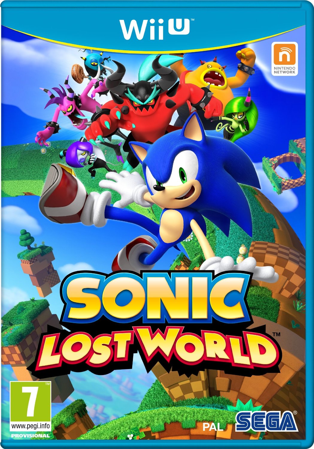
What’s Sonic Lost World, Scribblenauts Unlimited and LEGO City Undercover doing here? Well they’re published by Nintendo so I figured I’d throw them in as well.
I could just spam the page with jpegs but instead I’ll pick my favourite five Nintendo box arts from the past year and then you guys can check out the rest in the gallery at the bottom.
The Wonderful 101
Of course I’m going to start with this one, it’s what inspired this post in the first place. It’s a super awesome case that gives us a look at the main heroes in the game and throws in a giant fist too. Add in some motion blur as our heroes reach for the sky and you have a *wait for it* WONDERFUL looking cover that does the game justice.
The Legend of Zelda Wind Waker HD
If there’s one thing Zelda covers generally never have. it’s actual artwork beyond the game’s logo itself. I remember looking through the Wind Waker booklet on the GameCube and wondered why Nintendo hadn’t used some of the art in the case itself. Ten years and one HD remake later, my wishes have come true and the end result looks fantastic. Sadly Nintendo of America decided to screw it up by putting a gold/piss filter over it but Nintendo of Europe knew not to mess with a good thing.
Donkey Kong Country Tropical Freeze
This has to be like the most happiest cover I’ve seen in forever, you can’t help but smile yourself as you take a look at this cover. The three main characters are all showcased and keeping with the theme of the game, the outer portion is iced off which blends well with the Wii U’s blue cases. All I need know is for Nintendo to release a maxi sized poster of this so I can hang it on my wall to replace the Donkey Kong Country Returns one.
Mario & Luigi Dream Team Bros
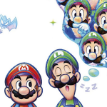
Whilst the first three cases I’ve shown you thus far have been ultra colourful, this one keeps it simple and elegant. CG style models for the cover would of been the obvious option but Nintendo went for a hand drawing style instead. Ultimately the reason it really works is because there’s not much going on, Luigi is dreaming of himself and Mario is giving him a “the hell are you doing?” look.
The Legend of Zelda A Link Between Worlds
This one is definitely a love or hate it case, personally I think it’s just unique enough that I like it. Usually I find myself a little bored of the gold looking Zelda covers but here it really seems very fitting. Something about this case just captures my attention, perhaps it’s the sense of mystery with a paper Link buried within a small stone wall. Maybe it’s the allure that we’ve come to expect from the Master Sword but whatever it may be, this one just does it for me.